


KING OF GAMES'S PROFILE

I'm a young fool and I make games via RM. I enjoy game mechanics and theories, especially new graphical experiments. I'm a master chip splicer and I draw my own resources as well. Teaching myself how to digitally paint via PS, after pixeling for several years.

Search
Filter
 wars screen 5.png
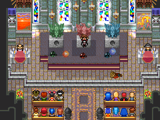
 Monstrous Wars
The torch is in the the attic of your house. There's no one that gives you a free sword, a couple places to check would be the weapon shop or the police station if you are stuck. Your access to areas is limited at first, and I hope you have the patience to get beyond the first town.
lessen.png
I like how you used hills as the house roofs, that's the kind of innovation that is missing from a lot of modern maps.
 post your picture

 Screenshot Sesame Street (40th Anniversary Edition)
You are in need of some serious flames man. That fire looks flat an unconvinving, like someone put orangey blankets everywhere. Where is the transparent burning look?
Interracial relationships....Tell me your thoughts...
One thing I noticed is it's always a white girl with a black dude, not vice versa. I guess white dudes can't appreciate hoodrats, for the beautiful people they are...
sc1.jpg
Why is htis downresd 3d? I think it would be cool if you used a prgram that could support the raw 3d graphics.
Screenshot Sesame Street (40th Anniversary Edition)
There is a readability issue between the floor and the brick wall. They are a little too close value wise. You want to keep the wall/floor relationship more like the wood to the lighter white walls. So you would have to make the brick wall ligher. Also, on the second floor the floor should be a bit lighter to complete the depth.
Also why ruin a scene with ugly fat refmap chars?
Also why ruin a scene with ugly fat refmap chars?
post your picture

corruption.png
Everything looks good except the message layout is awkward. It seems like everything is fighting for space. Make the message box regular size, forget about the name box (include name in reg message box.) And you can go 2 ways with the face. Keep the border and put it inside the message box, or lose the border and keep it on top.

